How we helped FlowBookings increase trial conversions by 68%
+68%
10+
SaaS
About the Client
FlowBookings is a native booking solution built specifically for Webflow sites, making it a category-defining SaaS product in a fast-growing niche.
They serve two key audiences:
- Webflow developers/agencies integrating bookings into client sites.
- Service-based businesses running their websites on Webflow
Despite having a strong product, their site was underperforming. The messaging was vague, the design lacked authority, and the conversion rate wasn’t keeping up with traffic. They needed a website that could sell as well as the software behind it.
The Solution
I approached the redesign with a clear thesis:
“If you’re first in a category, you need to look like the leader."
While most SaaS websites get caught up in explaining the features of their product, I did the opposite. I simplified the messaging and design to showcase the value of the product.
I built a conversion-focused website that looks premium and helps FlowBookings establish itself as the only choice for bookings in Webflow.
Services Provided
Full Website Design
Messaging & Copywriting
Visual Identity
Tools Used
Figma
Webflow
Relume
Client-First
Attributes
The Execution
When building SaaS websites, I follow a Message-Driven Design framework, which means the copy comes first, not the design. This approach is even more critical when conversions are low and clarity is lacking on a website like FlowBookings.
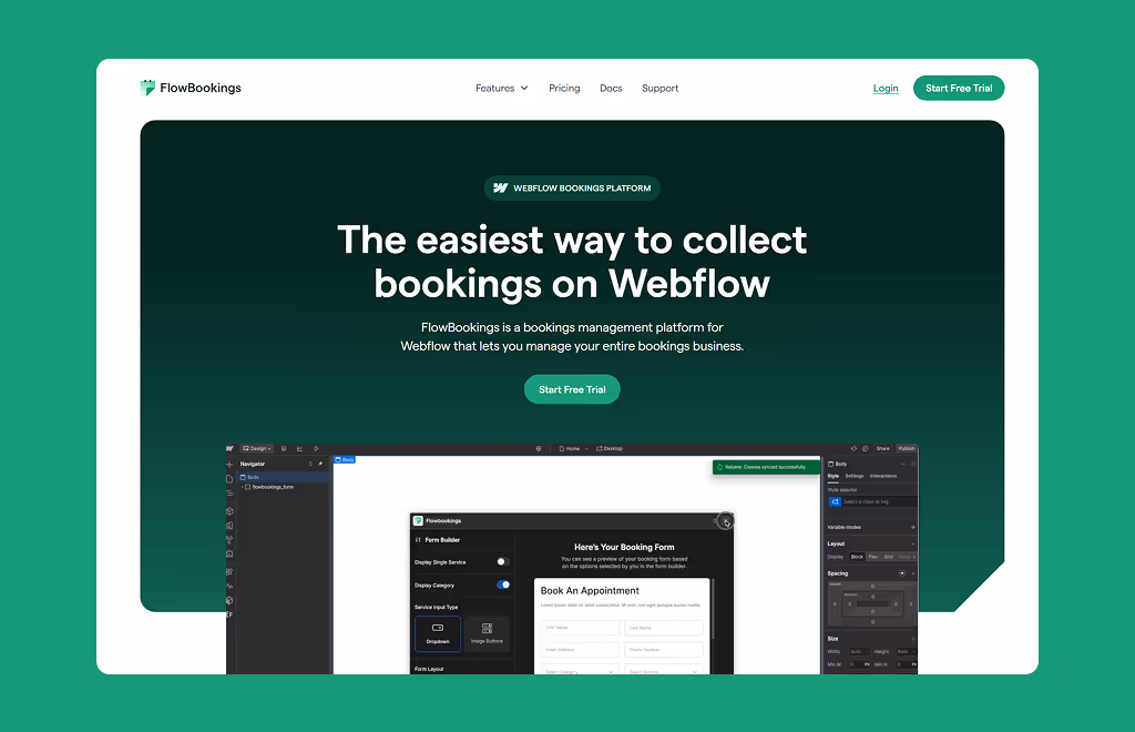
Rewriting the Narrative with Strategic Messaging
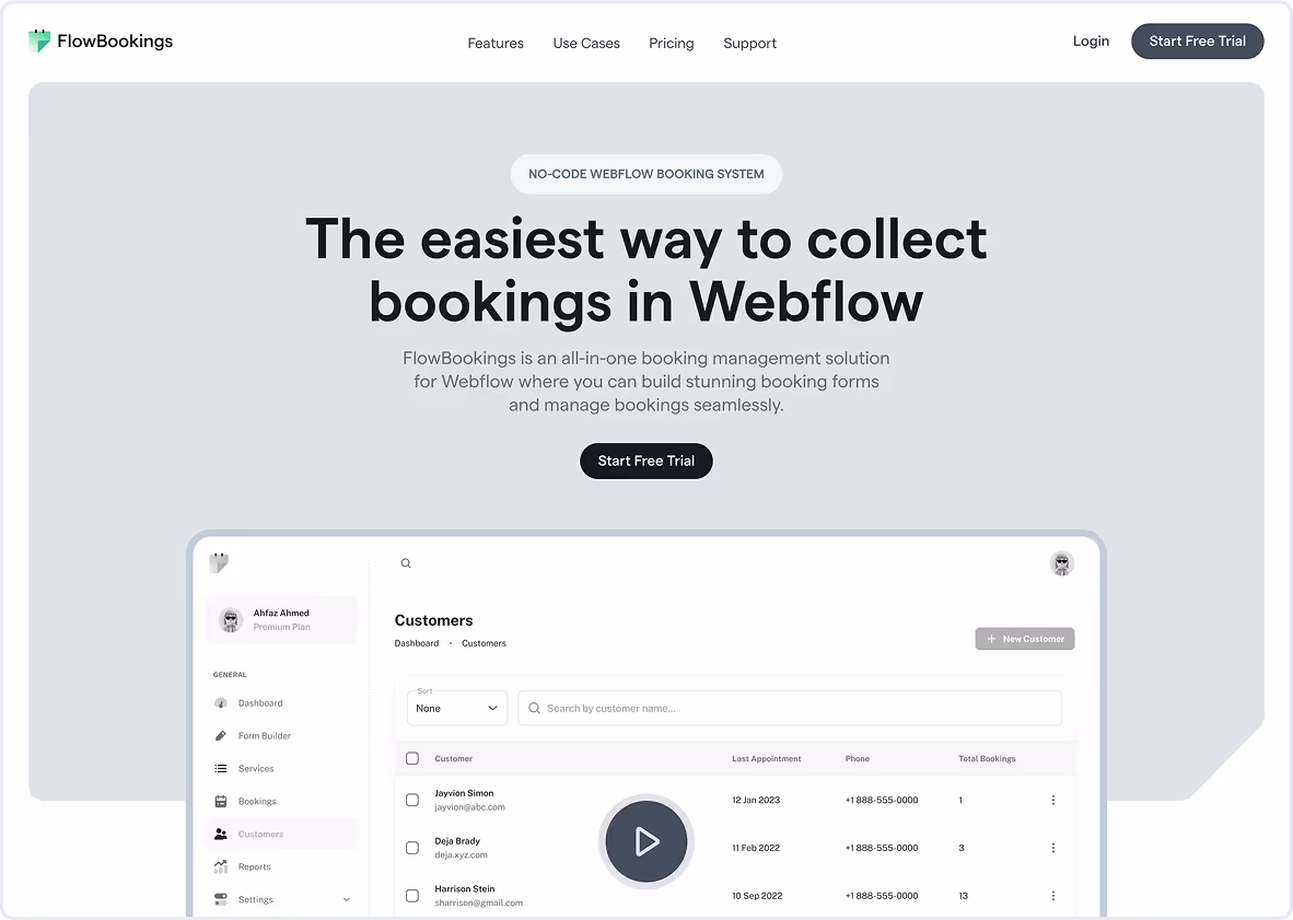
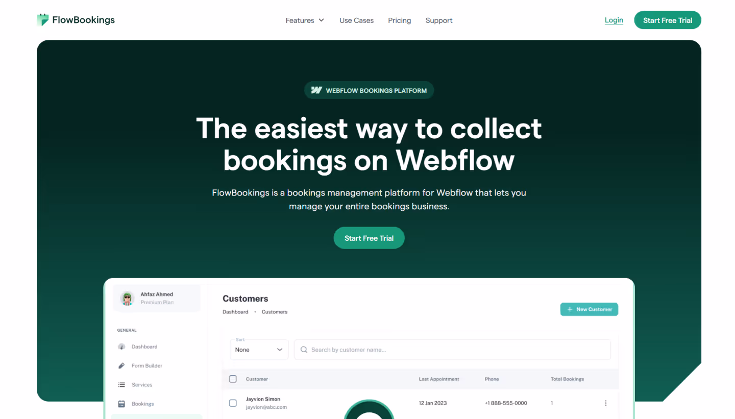
The first step was redefining the core value proposition. The original messaging, “Webflow Bookings Platform,” was vague, technical, and forgettable.
We repositioned the product with a single, powerful promise:
The easiest way to collect bookings in Webflow.
This new angle communicated ease of use, spoke directly to both target personas (Webflow devs + service businesses), and clearly explained what FlowBookings does in under 7 words.
All copy was rewritten around clarity and outcome. We cut technical jargon and replaced it with benefit-driven headlines that moved users toward a single goal: sign up and start booking.
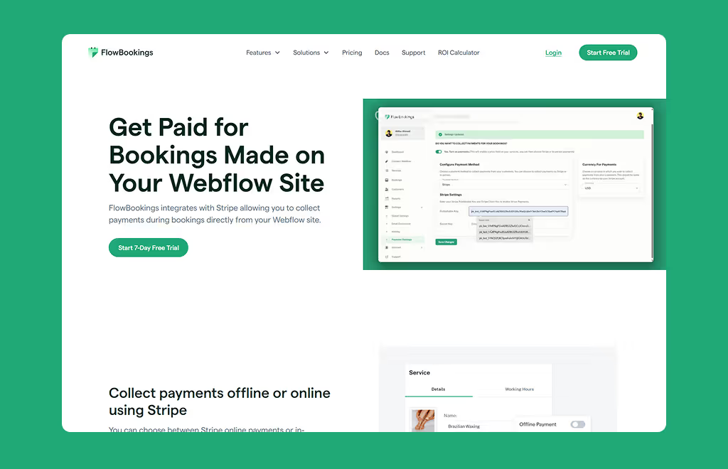
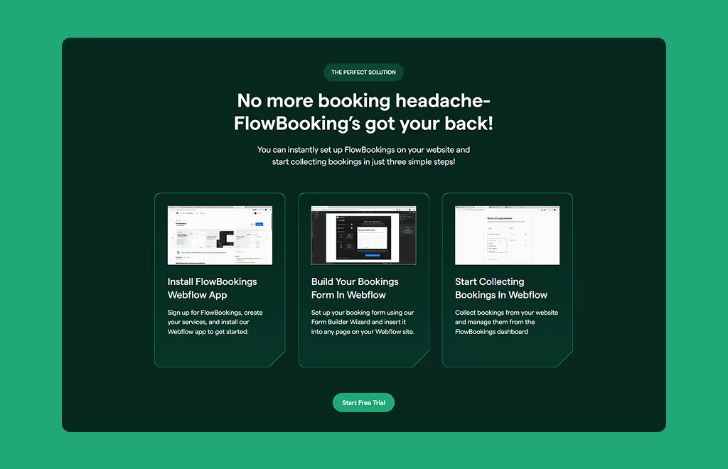
UI/UX Improvements
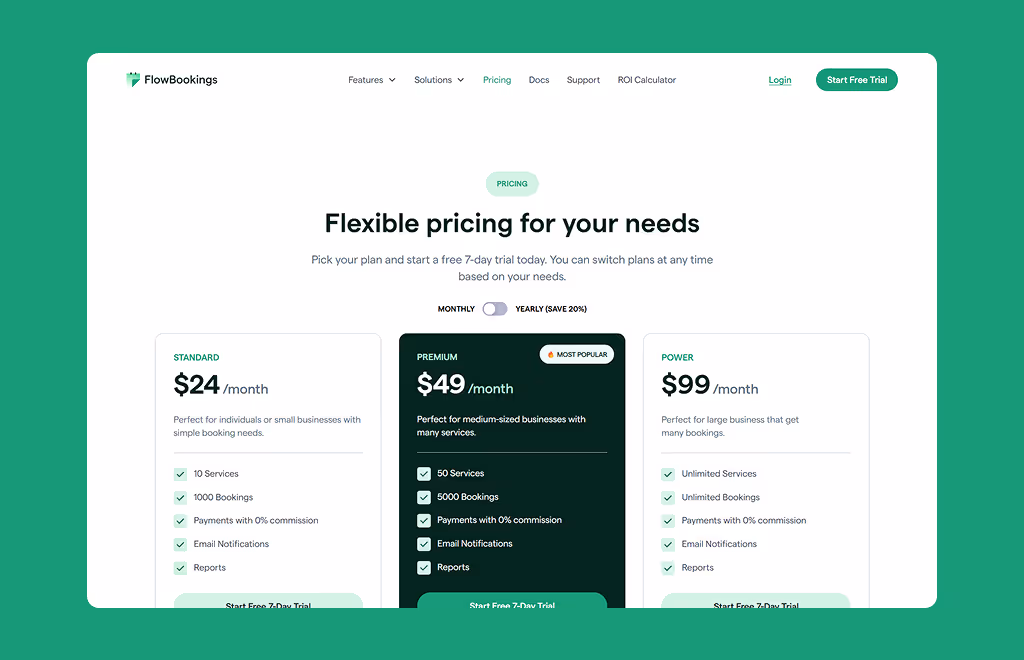
The structure and visual design were improved to support the messaging and guide users towards signing up for the free trial:
- Shortened the hero copy and embedded an interactive product demo
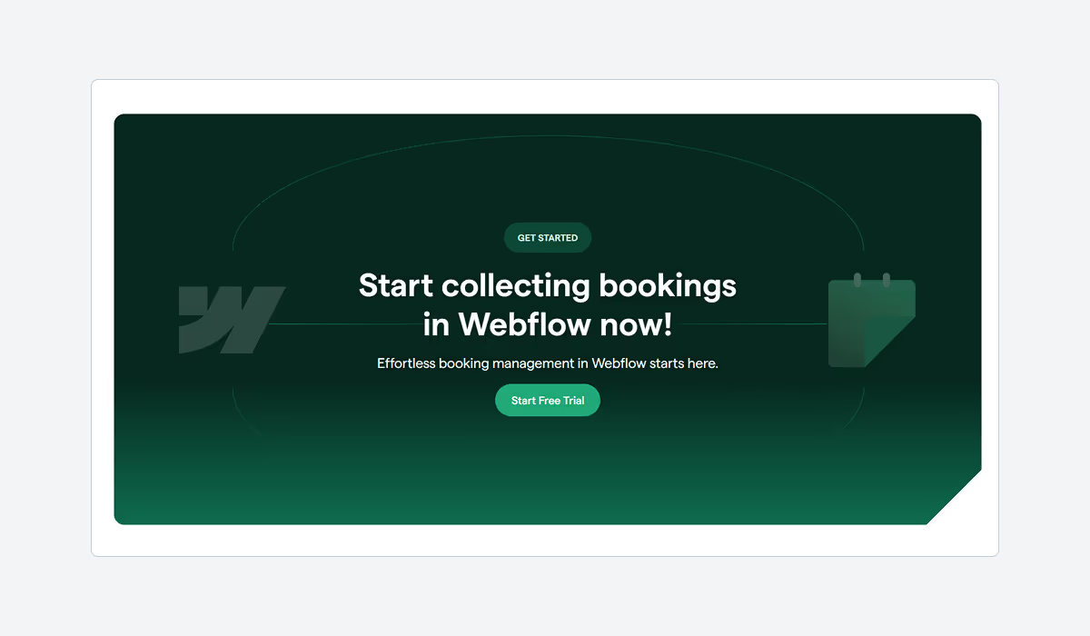
- Replaced vague CTAs with clear next steps (Sign up for 7-day Free trial)
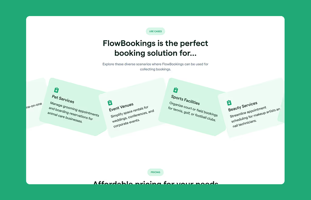
- Displayed Use Cases targeting different service businesses who could benefit from FlowBookings
- Used strategic contrast, whitespace, and callouts to move users down the page
“Does this get someone one step closer to signing up?”
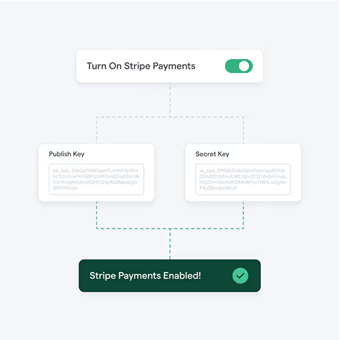
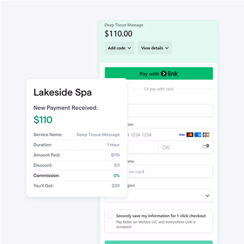
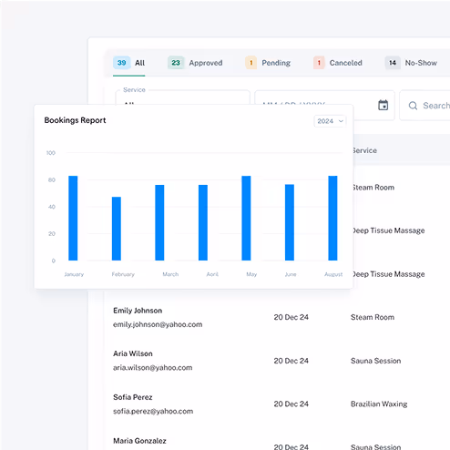
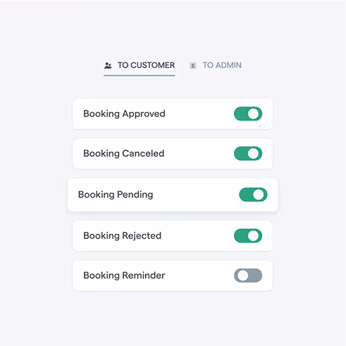
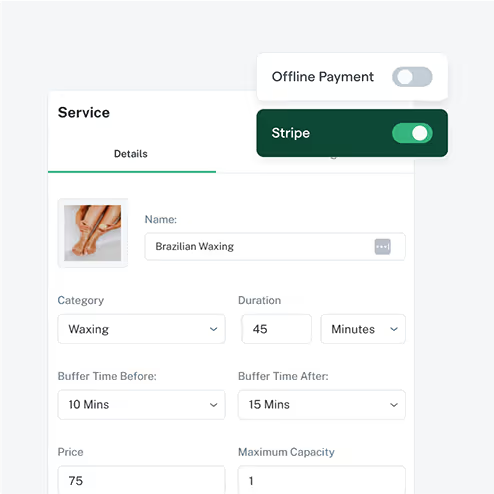
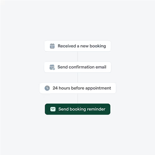
Redesigned Product Visuals
The original screenshots were low-res and failed to communicate what the tool actually did. They looked like placeholders.
I ditched those visuals and built visuals that did two things:
- Explained features visually, without needing paragraphs of explanation
- Reinforced the “easy-to-use” positioning through clean UI mockups and abstract visuals
Each product visual was designed to help the user imagine what using FlowBookings feels like.
The Results
Within 60 days of launching the new FlowBookings website, the results were undeniable. The redesigned site didn’t just look better but also performed better across every key metric. All metrics had a positive impact.
+68%
+19.73%
#1
Why It Worked
This redesign worked because it didn’t just look better, but it communicated better. Most SaaS websites fail because they confuse, over-explain, or try to impress instead of converting.
Here’s what made it effective:
Message-First Design
I led the design with positioning and clarity. Every section answered *“Why should I care?”* before a single pixel was created on Figma.
One Clear Promise
The easiest way to collect bookings in Webflow” is simple, sticky, and instantly relevant to both their core audiences.
Built for Action, Not Aesthetics
The layout, visuals, and flow were designed to move users toward the free.
Category Framing
The new messaging didn’t just sell features. I repositioned FlowBookings as the default for Webflow bookings for both their core.
The results achieved once again proved that the Message-Driven approach to SaaS website design not only helps clarify the messaging but also drives conversions.
The feedback on the design was positive from the customers and people in the Webflow community.
It was such a fun experience working on this redesign!
Want Results Like This?
If you’re a SaaS founder and your website isn’t pulling its weight and struggling with low conversions, high bounce rates, or unclear messaging, then it’s time to fix that before you lose potential customers and revenue.
I build message-driven, conversion-focused SaaS websites that turn traffic into trials and browsers into buyers.
Book a strategy call and where I’ll share how your website can convert better.

Next Case Study
Vindhya Infomedia